Cycling: where to place bike-share stations?
Published:
A non-parametric model for placing bike share locations & an exploration of bike friendliness in world cities
Whether you bike professionally or as a hobby, you probably know how much riding a bike has to offer. From mountain trails to riding across cities, a bike allows you to explore new places, get some exercise and socialise along the way. In this short story, we are going to be looking at the best cities to be riding a bike, all from a data science viewpoint. First, let’s look at some of the tools we’ll be using.
Tools and Data:
- Jupyter Notebook
- OSMnx
- Networkx
- Seaborn
- and Python
- Data: Dataset of major world cities and their populations (link: https://data.un.org/Data.aspx?d=POP&f=tableCode%3A240)
Criteria:
What makes a city bike-friendly? First off, it should have dedicated cycling routes and lanes. Let’s define this as the ratio between the length of cycling routes and that of the total routes. The higher this proportion is, the more bike-friendly a city will be. To calculate this, we should generate the bike and overall streets network for a particular city, say Tokyo, like so:
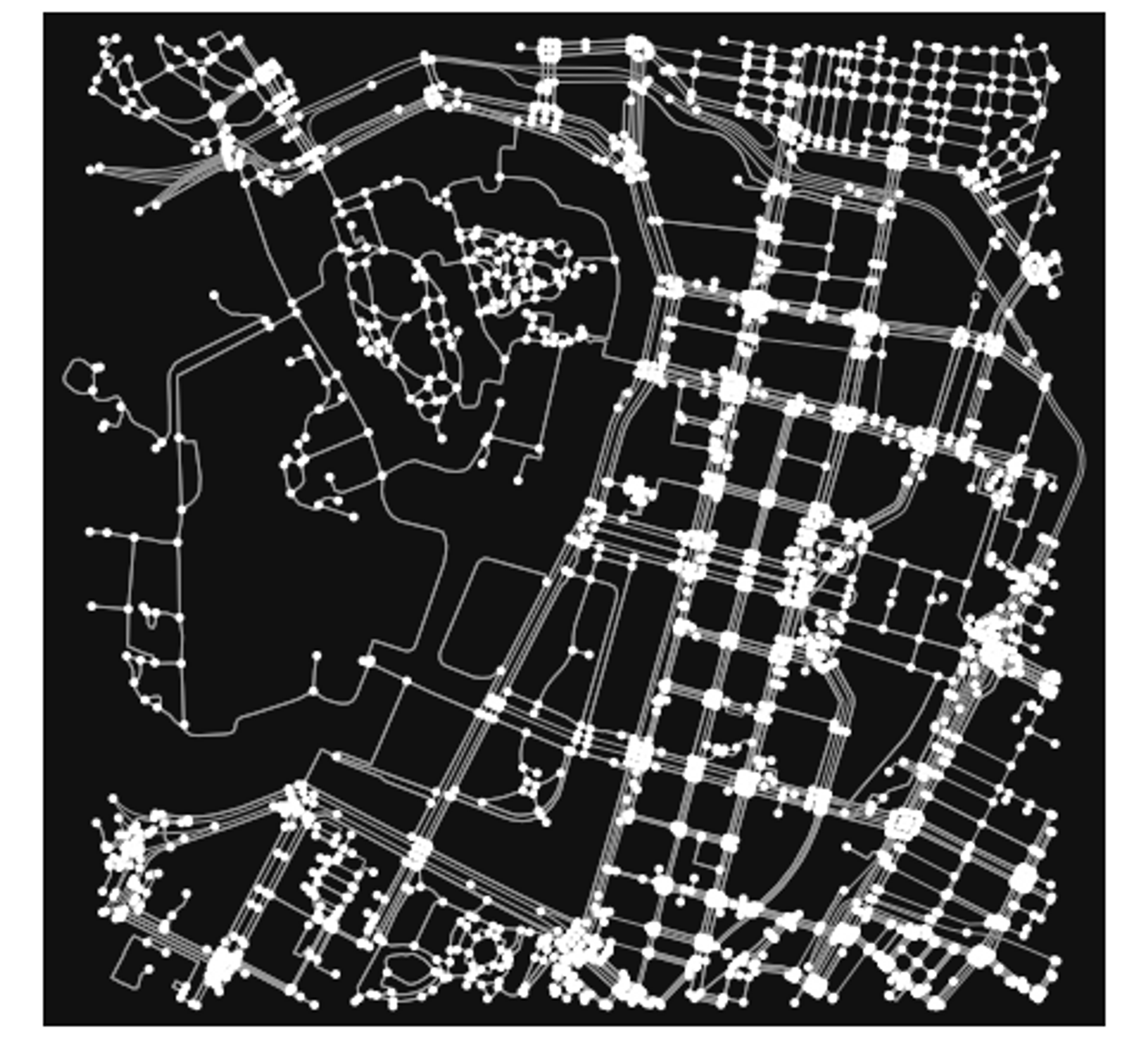
Now, let’s calculate the bike lanes to total roads ratio for one hundred cities and look at the results, done using OSMnx street length function. Here is a bar chart of the top 20 cities with the highest percentage of cycling routes, generated using Seaborn:
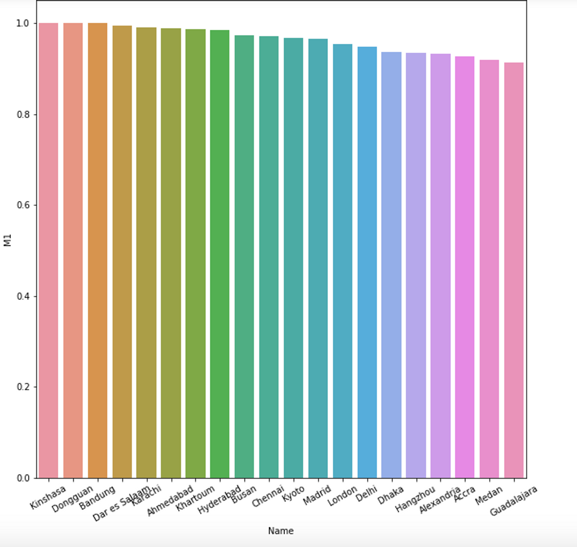
For this metric, the top cities are Kinshasa, Democratic Republic of the Congo with a score of 1.0, meaning all streets are bike accessible, followed by Dongguan, China and Bandung, Indonesia.
Next, we can look at how much cycling routes are available per population. Thus, we can define another metric: length of cycling lanes per city divided by population density. Larger values will mean there are more bike lanes available for a city’s residents, thus making in more bike friendly. Smaller values, on the other hand, will mean more people using less bike lanes. Let’s have a look at the code and then at a bar chart of the 20 largest values:
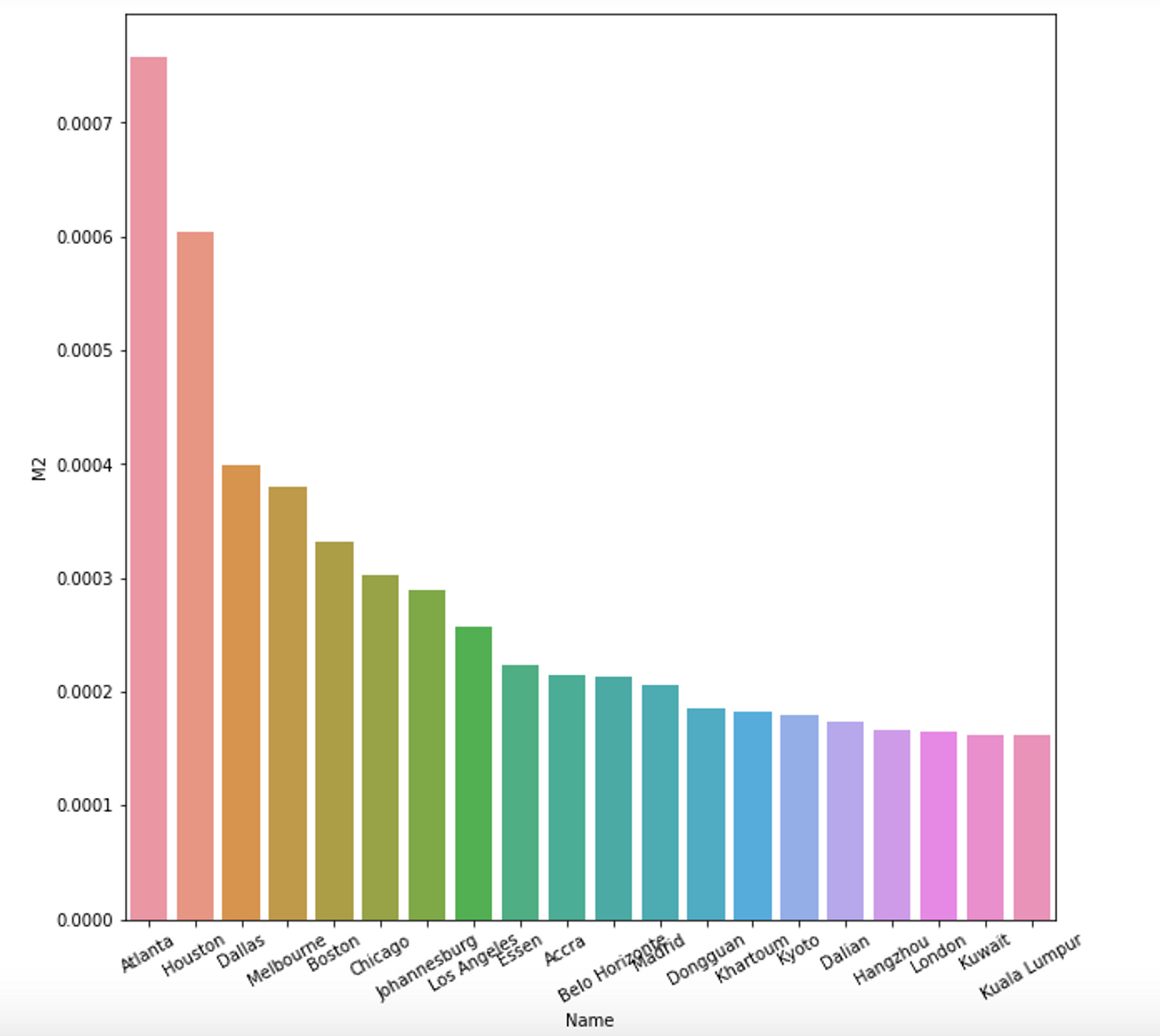
The data here shows a different story from our first metric, with Atlana, Houston and Dallas, all in the US, scoring the highest. So, let’s look at some of these cities street networks, namely Atlanta and Kinshasa. First, here are the plots of the networks for each city:
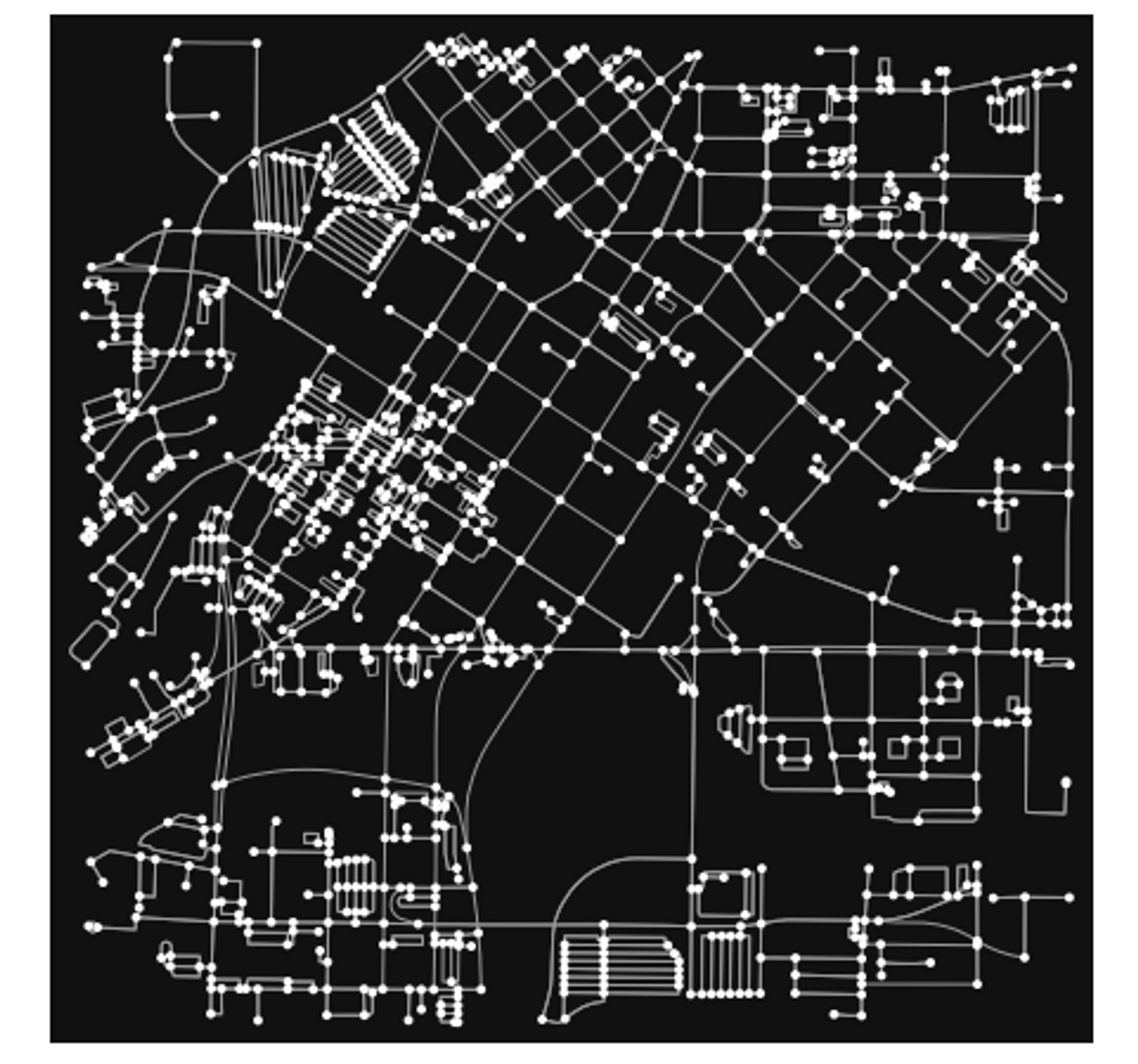
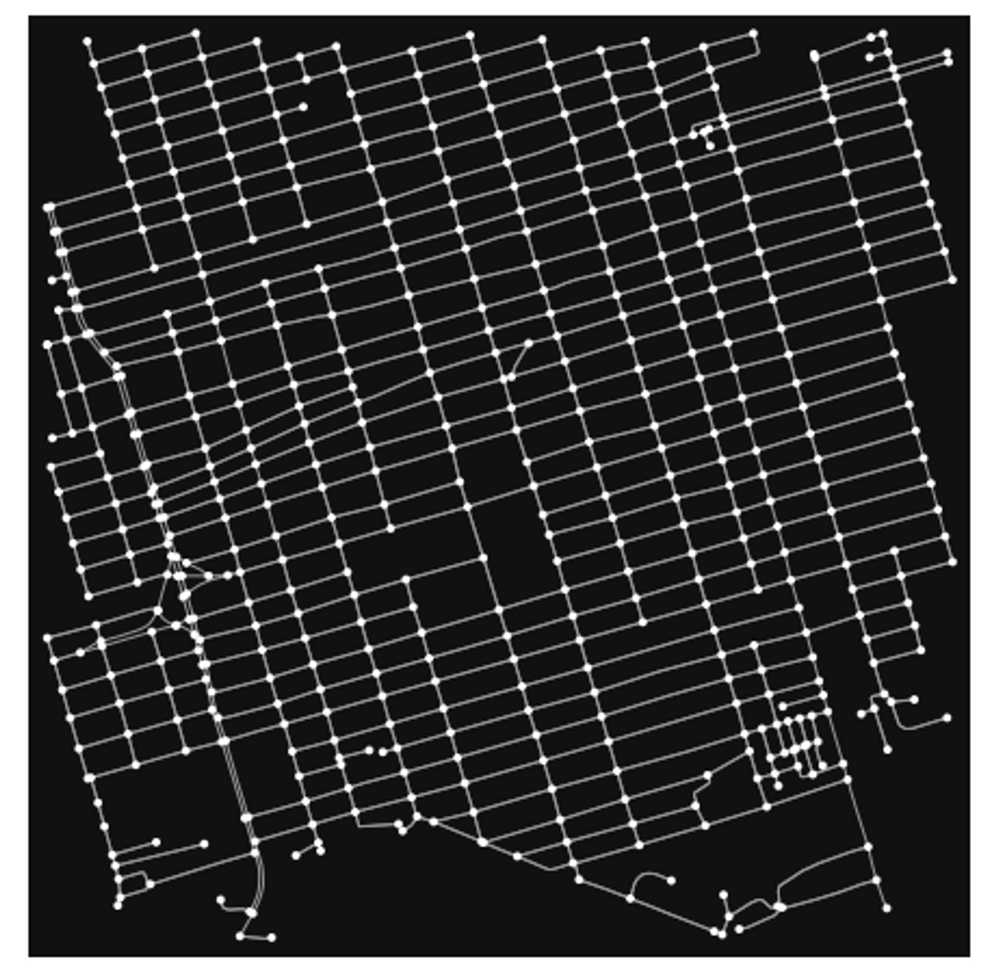
They certainly look different from each-other, with some visual differences. The Atlanta network looks slightly more “clustered” around some areas, whereas the Kinshasa one looks very symmetrical and evenly distributed. We can quantify these differences using OSMnx. OSMnx provides a function called “basic stats”, which we can use to look at various metrics about a city’s street network. Here are the variables we will be using put into a Pandas DataFrame:
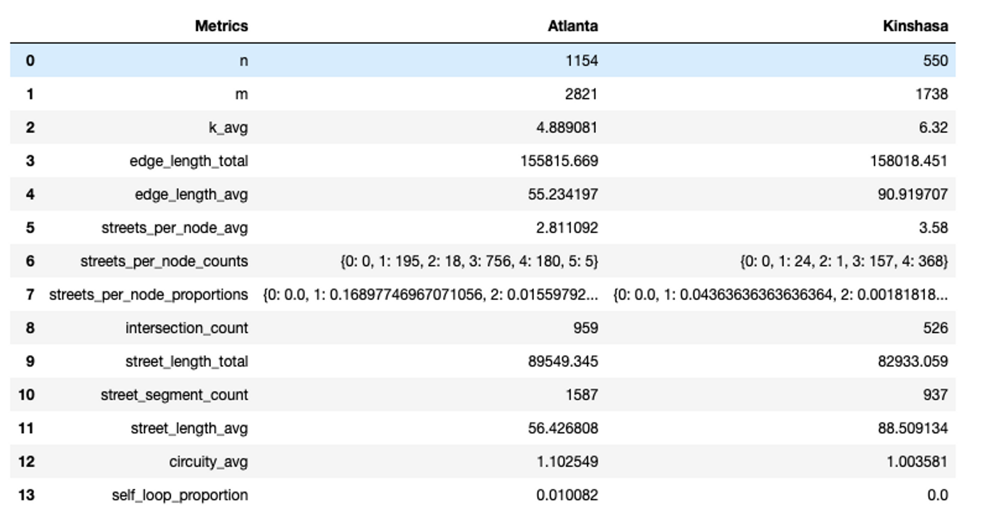
First off, ’n’ and ‘m’ stand for the number of nodes and edges in a graph respectively. As you can see Atlanta has more of both. Then k_avg stands for the average node degree, meaning the average number of roads emerging from or entering nodes in the graph. In this case, Kinshasa has a higher value of this metric.
For the other metrics, you can see that Atlanta scores higher in the intersections count, and the street length total, but Kinshasa has a higher street length average, which help make sense of the graphs we saw above.
For the second half of this story, I want to spend some time thinking about how we can place bike share locations to make cities more bike-friendly. Tirana is my hometown, and recently I have been inspired by its new initiatives in promoting biking as a commuting and health activity, especially through the addition of protected bike lanes, special “no car” days and general road safety measures. However, the city does not have a major bike share platform, so I wanted to address this issue using machine learning.
Firstly, some setup. When thinking about optimal bike station locations, it makes sense to consider factors such as population clusters, proximity to other public transport or clusters of business areas that people usually commute. That is because setting up a successful bike share service would involve making sure as many people as possible have access to it, and they can feasibly and reliably use it daily to get to work or other places. The mayor’s office provides some information on each administrative area’s population as well as the routes for public transport stations. We are going to build off of these two at first and use K-Means clustering and Folium to visualize our predictions.
The Data
Here is the dataset of the population counts for all of urban Tirana’s 11 administrative areas (taken from this website:https://opendata.tirana.al/?q=popullsia-e-tiran%C3%ABs-2020). To make it clearer, I have also added a map using GeoPandas built-in plot function:

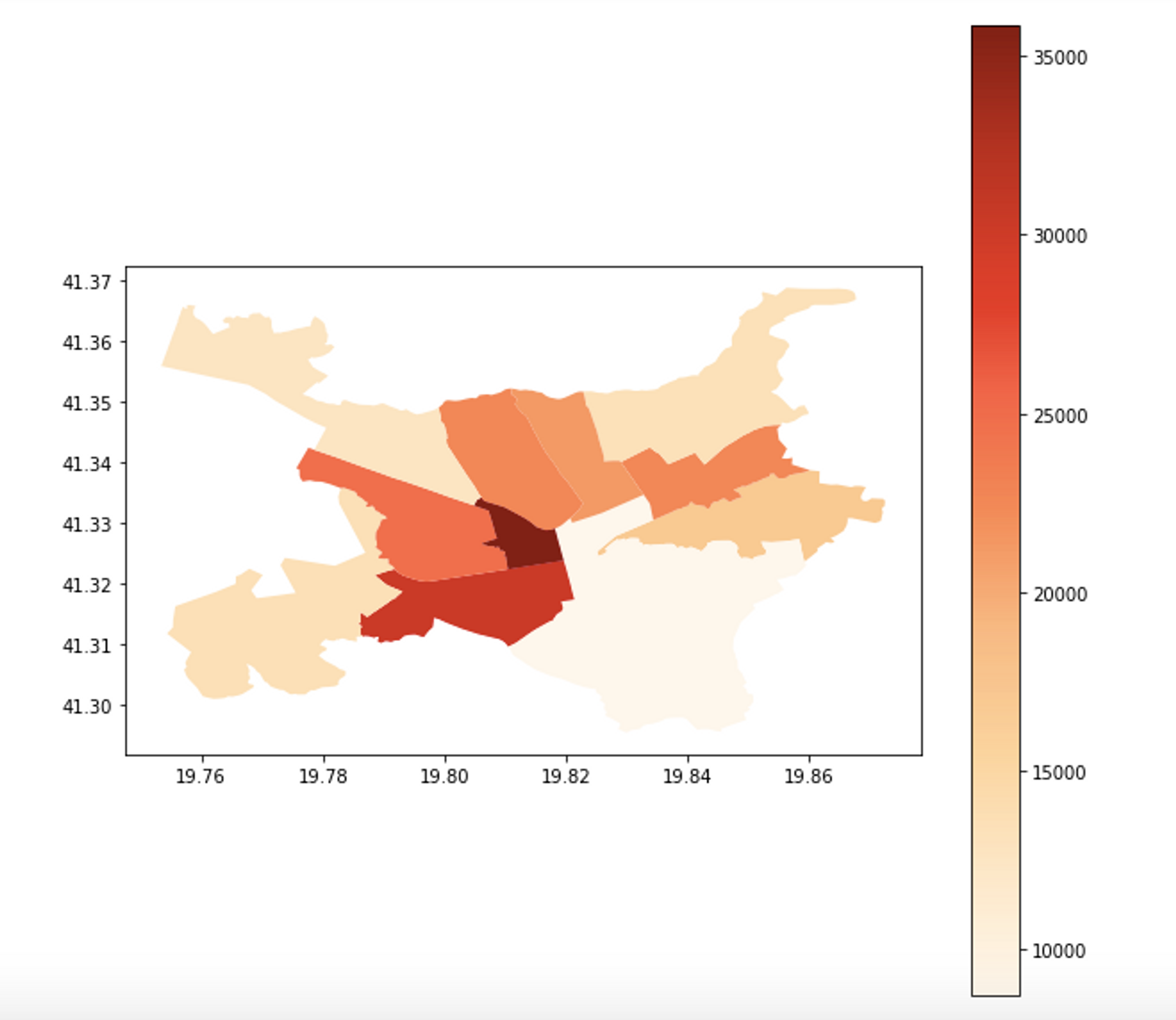
The map above is actually plotting densities of areas, to account for various area sizes, and I chose a red sequential palette to make the distinctions between different values clear.
In addition, we also have access to bus station data, which represents the major bus lines and stopping points (taken from this website: https://opendata.tirana.al/sites/default/files/linjat_e_autobus_ve_publik__dhe_stacionet.geojson). Tirana does not have a subway system, so most of public transport is actually carried out by buses. Below, you can find the data frame and a plot of the bus stations map:
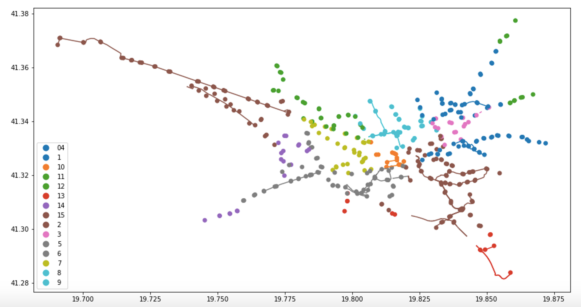
Cool! Now let’s get to modeling. First, let’s fit a K-Means cluster model to our data. The features that the model will take in as input will be the x and y coordinates of the bus station points, and it will output a number of clusters. Here is the fitting and the predictions:
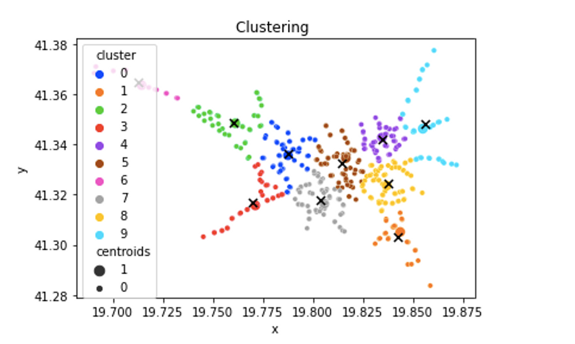
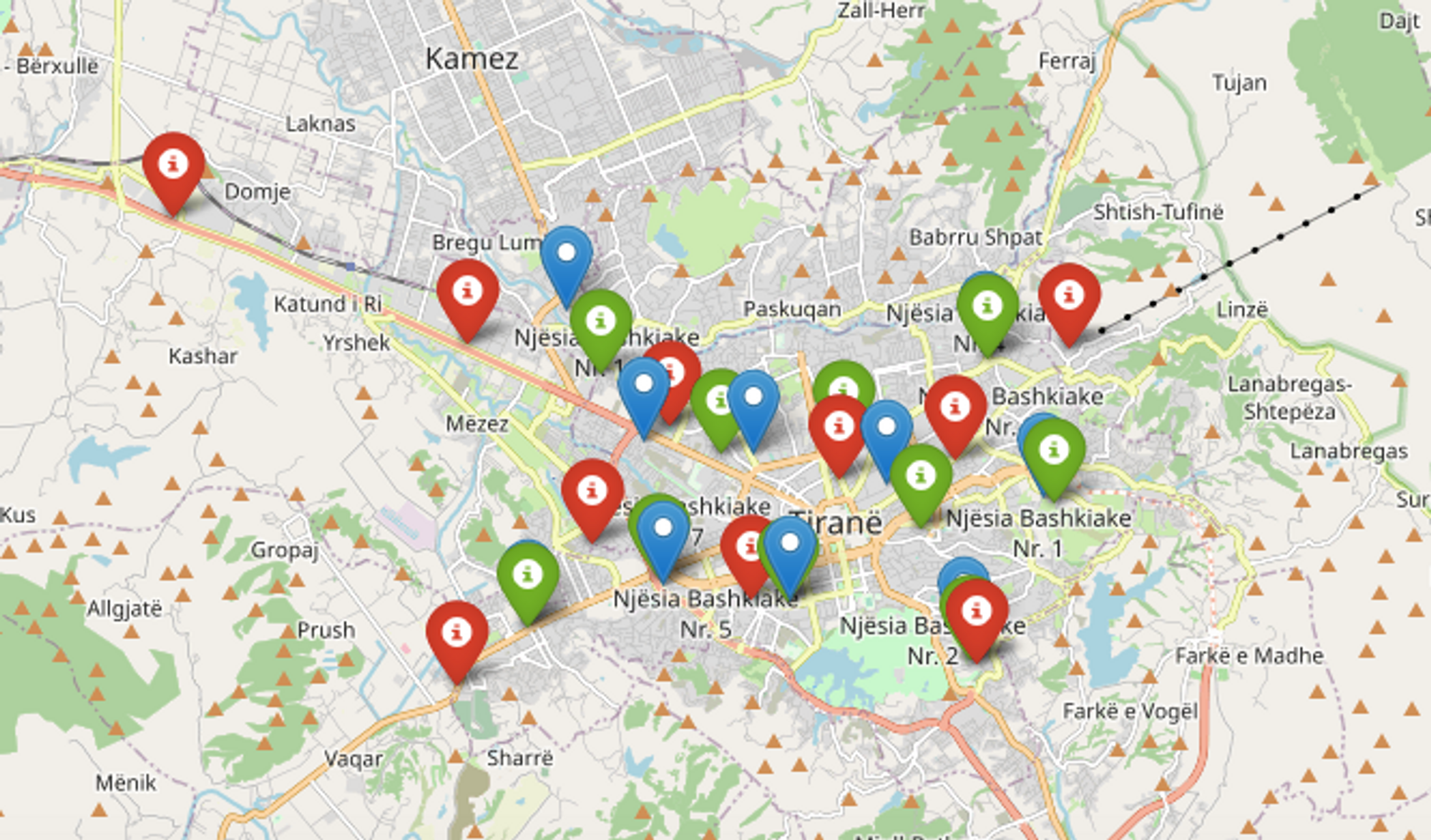
Now that we have some predictions, let’s visualize them in context, or in the geographical space of Tirana. To do so, we can use Folium, a Python package for map visualizations that allows us to add pop-ups like so:
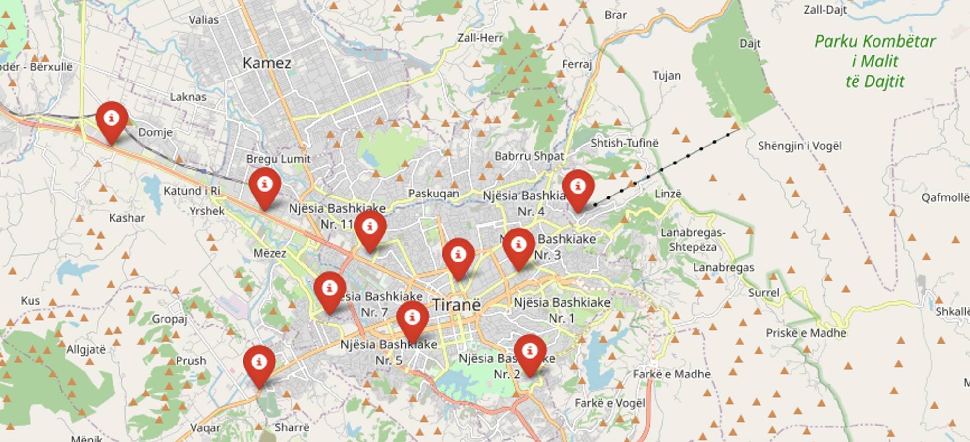
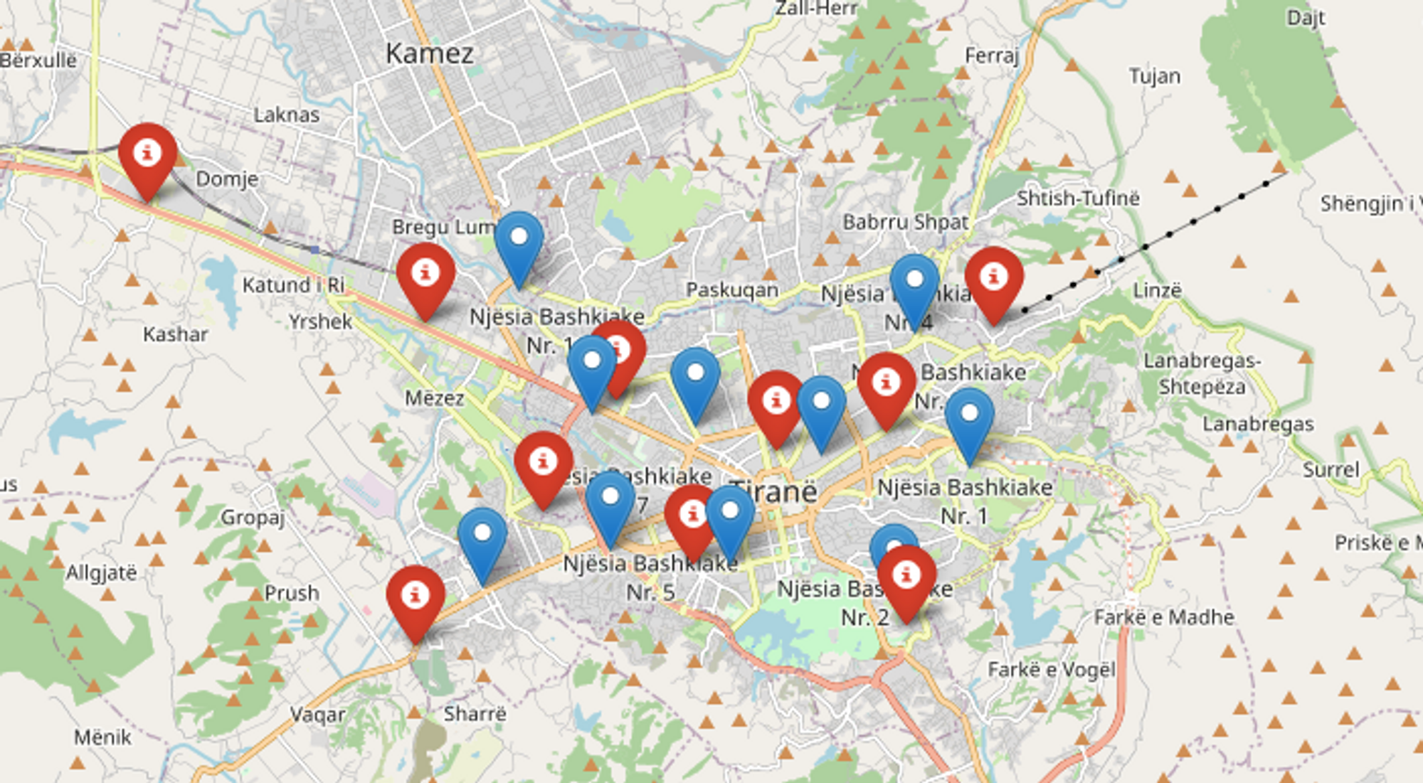
However, is this model good enough? One thing to keep in mind is that our current model does not account for the population size being served by these stations, so it might not be representative of the places with the most demand for bike share services. Luckily, we can pass in a “weight” argument to K-Means Clustering that will consider the population size when clustering data as well:
Let’s now map the two clustering results together to see how the predictions changed:
Refining the Model
From this point, we are going to be continuing with the weighted K-means model, and trying to improve upon it. Before we start doing that, let’s look into how to score the models we are producing. We are going to be using the Silhouette Score and the Calinski Harabasz score. The former takes values from -1 (worst) to 1(best), and it is calculated as the mean intra-cluster distance and the mean nearest-cluster distance for each sample. The latter is not bounded above by a value, rather it is defined as the ratio of the sum of between-clusters dispersion and of within-cluster dispersion for all clusters.
So we can see that the Silhouette score actually goes down in the second, weighted model , as does the Calinski Harabasz Score.
How many clusters to use?
Another aspect of building the model is considering how many clusters to separate the points into as it has many implications about the overall structure of the clusters and how many points go into them. Here is how to do that in code, and visualizing it in a plot:
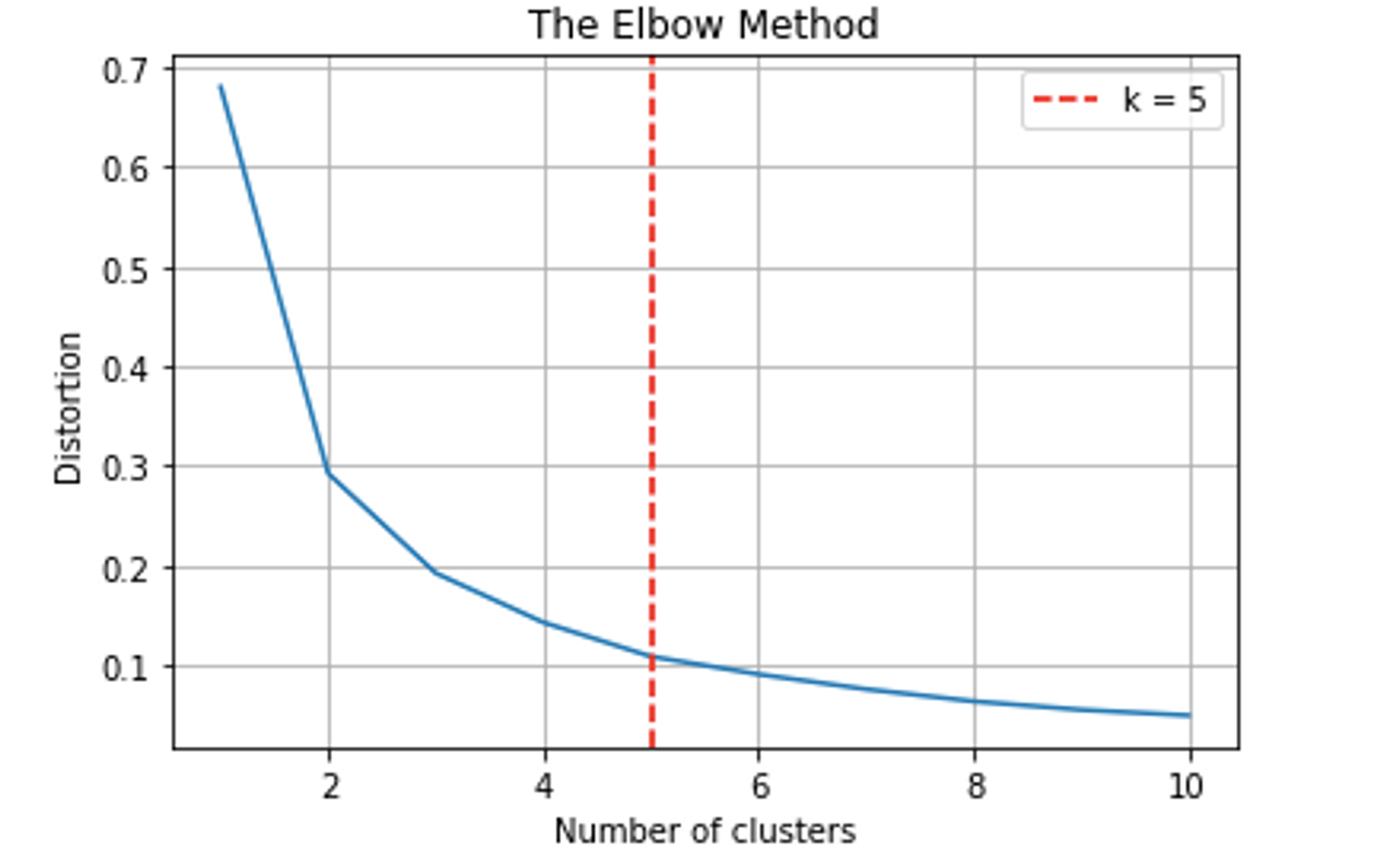
Let’s apply this optimal number of clusters to our model, and update our map to show them, added in green:
Conclusion
In this short story we looked at how to build a model that would predict the best places to put bike stations in a metropolis, in this case Tirana, and we explored and refined the parameters of our model. Some next steps after laying the groundwork would be to fit other unsupervised models to the data, such as Self-Organising Maps, and to supplement the dataset with more information about details such as traffic conditions, number of people that work in a location, and perhaps also pollution data. These could inform a more sophisticated model, which could eventually be implemented in the real world.
Thank you for reading!
