Music Analyzer: exploring Spotify Songs & Building a Popularity Predictor
I have been using the Spotify app for the past year to listen to my favorite artists and get new song recommendations. Recently, I learned that the app classifies the tracks according to a system of audio features, and that it stores them in a database easily accessible through its API. So, I thought: can we use this database to understand the tracks in it better? That is, can we discover any trends based on subgroups of music divided on things like popularity or year it has been released? Let’s begin:
Audio Features:
According to the Spotify website, all of their songs are given a score in each of the following categories (taken from the Spotify API documentation, https://developer.spotify.com/documentation/web-api/reference/):
- Mood: Danceability, Valence, Energy, Tempo
- Properties: Loudness, Speechiness, Instrumentalness
- Context: Liveness, Acousticness
The data I will be using comes from this Kaggle dataset: https://www.kaggle.com/yamaerenay/spotify-dataset-19212020-160k-tracks?select=tracks.csv.
1. Top 100 Most Popular songs versus all of the dataset
First, let’s compare the top 100 songs with the rest of the dataset. This is done by sorting on the “popularity” column:

Now that we have the data, let’s take a look at the features for each song. For this subpart specifically, we will be looking at the mean values of the features for the top 100 most popular songs, as well as all of the dataset. To visualize this we can use a radar chart as below.
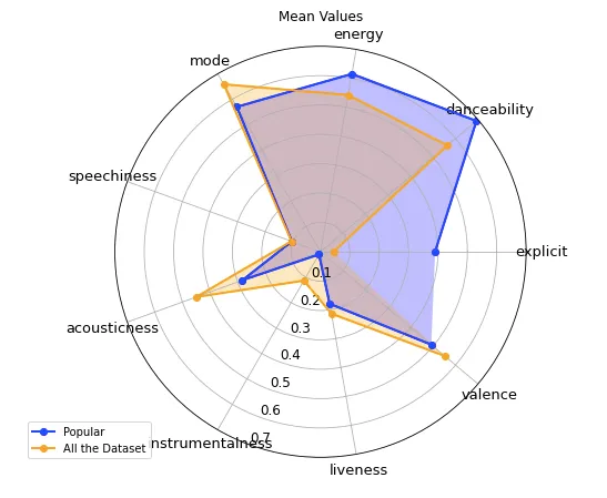
Looking at the plot, it seems like there are some differences between the two songs subgroups in almost all of the audio features. That is, the most popular songs are more “energetic” , “danceable” and have a higher “explicitness” value. The rest of the songs score higher in the “acousticness” and “valence” category, which can be interpreted as conveying more positivity, by Spotify’s definitions of the features.
Comparing the songs in a box plot
Since we saw there were some differences in the features of the two groups, how about we take a better look at them? Below, you can find box plots of these features with 0 meaning the data is taken from the top 100 songs and 1 from the rest of the dataset.
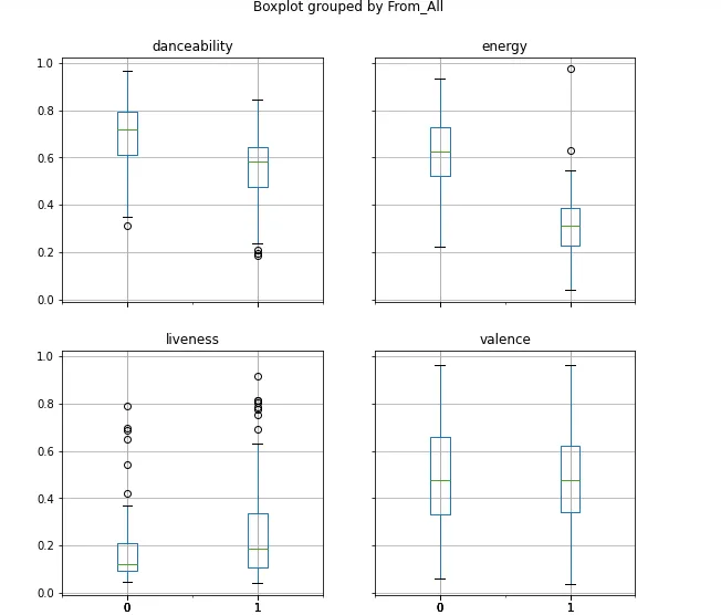
The box plot also shows some differences in the features of the two groups: in the “liveliness” subplot, the popular songs portion is shorter than the rest of the dataset’s. However, largely, these plots confirm the observations we made above about the groups.
Energy versus Danceability
Let’s now draw a scatterplot to see if there is a correlation between the “energy” and “danceability” features. Besides the top 100 most popular songs, I also chose 100 songs at random from the rest of the dataset. In the plot below, there are two different colors, with yellow signifying 100 random songs, and purple the top 100 songs.
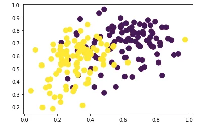
The calculated Pearson correlation coefficients are: 0.35156523 (for the yellow/all of the dataset points) and 0.20520467 (for the top 100 songs).
Valence and Liveliness
Another scatterplot we can draw is valence versus liveliness. “Liveliness” stands for the probability that a song was performed live in front of an audience or not. The legend for this plot is the same as above:
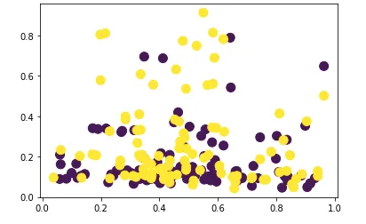
Interestingly, there does not seem to be a strong linear relationship between these two variables. Here I also calculated the Pearson coefficients like in the scatter plot above: -0.09403765 (for the yellow points) and 0.02555036 (for the purple points).
3. Comparing the Eras: Pre 90s versus Post 90s
In addition to comparing the popular songs and the rest of the dataset, we can also look at the differences in songs between different eras. For the purposes of this tutorial, I will be defining the eras to be before 1990 and after 1990. Let’s now look at a similar radar plot as above but with these two categories (the code for the plot is basically the same so I won’t be showing it again here).
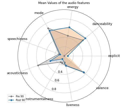
According to the box plot, there are a couple of differences in the music of the two eras: firstly, post 1990s music is more “energetic”, “danceable” and “explicit”. Whereas other features like “valence” and “liveliness” are pretty similar amongst the two. Pre 1990s music also tends to score higher in “acousticness” and “instrumentalness”.
4. Visualising the most popular artists
The dataset also includes the names of the artists for each song, but in list format. To parse the individual names, we can use “re”, which is a very useful text manipulation package. First, we remove the “[” and “]” from the lists and build a text pattern to search for in the data. Since artists usually go by either their full names or one artistic name, the pattern looks for one or two words, separated by one character like so:
Then, we perform the search in the column of the dataset and we use another Python package called “collections” to count the occurrences of each artist:
Here are the results from counting the artists in the top 100:
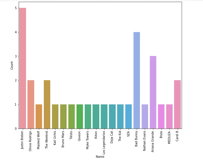
The top artist is Justin Bieber (5 songs) and Bad Bunny (4) songs, reflecting the public’s preferences in April 2021 when this dataset was collected.
5. Graphing Audio Features Similarities
For this part, we will be using the networkx package for plotting graphs to visualize similarities between songs. The features to use will be the Spotify audio features, and we will calculate song similarity using cosine similarity, which is a commonly used approach to measure similarity between objects (such as songs, movies or books). One question we might try to answer is which songs are similar to many other songs. That is, are there songs which “sound” similar to others? Let’s put a lower bound on a song’s similarity to another to be a cosine similarity of 0.95.
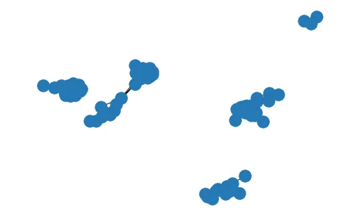
As you can see in the graph below, not many songs are very similar to each other, since the graph contains fewer nodes than 100, which was our initial number.
Let’s also get some other information about the graph, such as the average degree that tells us the mean value for how many songs a track is similar to:
- Average Degree: 12.494845360824742 (songs are on average similar to about 12 other tracks)
- Number of Nodes: 97
6. Getting the Lyrics Data
For this part, we will also be analysing the lyrics data from the songs in the dataset. In order to do so, we can use the LyricsGenius API. Since the dataset is very large, I will be again selecting around 400 songs at random to visualize. In order to search for lyrics with LyricsGenius, you need to have both the song and the artist name, so the code below is extracting both of these pieces of information and also searching for the lyrics:
Selecting and scraping 400 random songs from all of the dataset
7. Lyrics Analysis
Now that we have looked at the audio features of the most popular songs, we can also try to analyse the lyrics of a subset of the data. For this part, we will be using Python’s TextBlob package to perform text analysis on the songs we selected in step 6 above.
- Text Sentiment Analysis: Polarity
One aspect of the lyrics is its polarity, or whether the text is considered positive (values closer to 1) or negative (values closer to -1). Here is a box plot of the polarities of the songs subset:
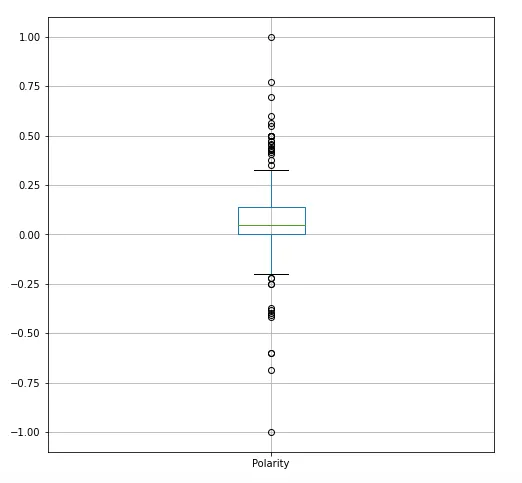
While the median of the metric is around 0, meaning the songs are mostly neutral, there still are many outliers in both directions of the plot. That shows that there are many positive and upbeat lyrics, as well as negative ones.
- Part-of-Speech Analysis
When doing text analysis, looking at part-of-speech tagging is also important in understanding a document. You can read more about all of the parts here: https://www.geeksforgeeks.org/python-part-of-speech-tagging-using-textblob/. In this story, we will be looking at NN (singular nouns), NNS (plural nouns), RB (adverbs like “very”), RBS (superlative adverbs), RBR (comparative adverbs), and VB (base form verbs). Let’s see how the 400 songs we picked are composed in terms of the the percentages of the parts above using this code:
Now that we have these metrics for every song, we can visualize them using a box plot:
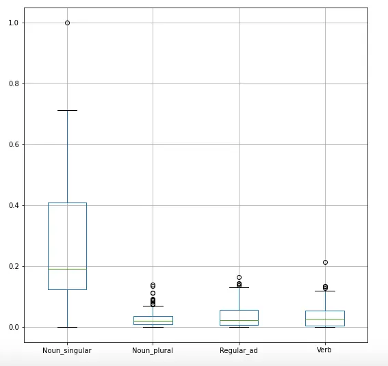
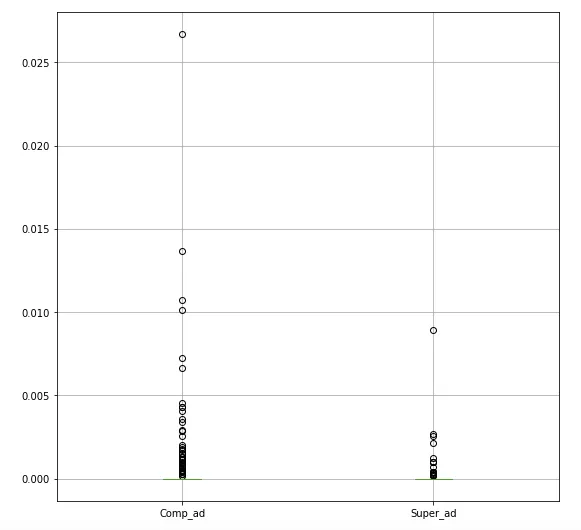
As you can see, singular nouns make up a large portion of the lyrics, followed by verbs and regular adverbs. Comparative and superlative adverbs on the other hand don’t show up very often in the lyrics.
**7 Building a Regression Model
Lastly, I wanted to use these findings to construct a model that predicts a song’s popularity given its features. As a start, I am using a linear regression model of a few of Spotify’s internal features as predictors for popularity. Here is a test of the linear relationship of these features:
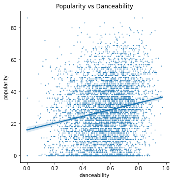
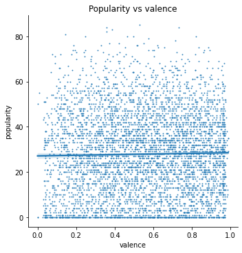
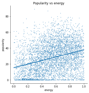
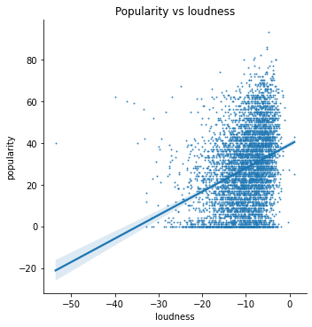
The features I am using are:
- ‘duration_ms’, ‘danceability’, ‘energy’, ‘key’, ‘loudness’, ‘mode’, ‘speechiness’, ‘acousticness’, ‘instrumentalness’, ‘liveness’, ‘valence’, ‘tempo’.
First, I needed to check the normality in the features:
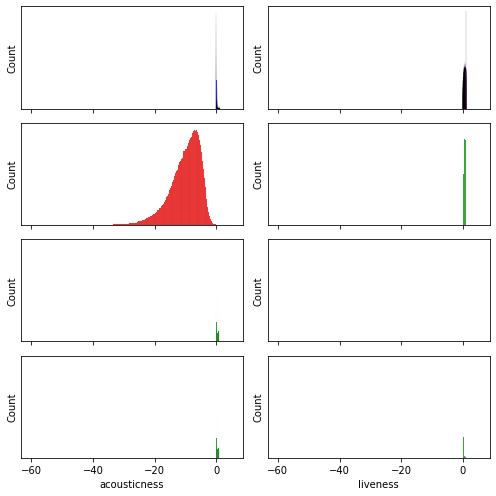
In order to make the data fit a normal distribution, I take the log-transformed features which to approximate a normal distribution, especially the “duration” and to some extent the “loudness”. Let’s remove some outliers from the data, so that we can bring the others to fit a normal distribution as well. We will do this for the danceability and the speechiness columns.
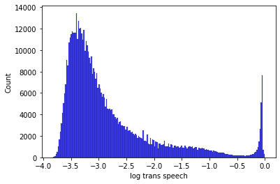
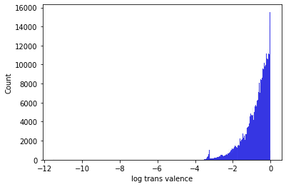
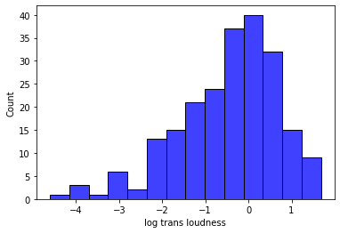
I am also checking multicollinearity between the features:
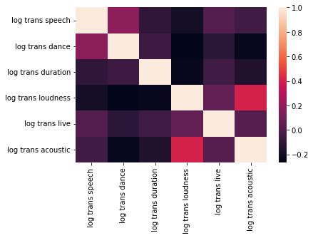
The collinearity between them appears to be relatively small (-0.2 to 0.2). Now, we can fit the model. Here is a plot of the fit, along with metrics like MSE and R squared:
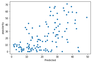
- MSE: 266.64483397101714
- MAE: 12.40898957243052
- R squared:0.340880153380248
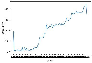
Given these preliminary results, I also wanted to perform feature engineering on the data and specifically on “publication date”. As we examined in the first part of this project, we have some data relating to the publication year. In the plot below, we can see that an increasing year generally leads to an increase in popularity, so we can work that into our model as well:
Now, let’s try to add some more features to the model. One feature we looked at was song similarity, i.e. how similar a song was to the others, and we visualized them using networkx. We can create a metric to measure this, and add it to our model and fit it again:
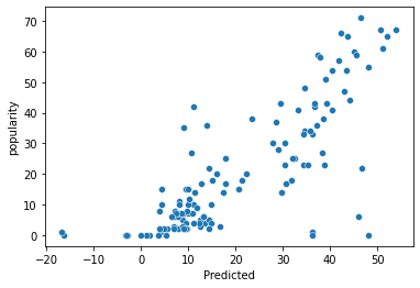
- MSE: 145.900482529075
- R squared: 0.639348333758589
Interestingly, now that we fit a couple more features, the mean squared error fell dramatically, and the r2 also rose by a great amount, which is a great improvement over our initial model.
Fitting a Non-Parametric Model: KNN Regression
In addition to the parametric method we just fitted to our data, we can also attempt to fit a non-parametric model, starting with KNN Regression:
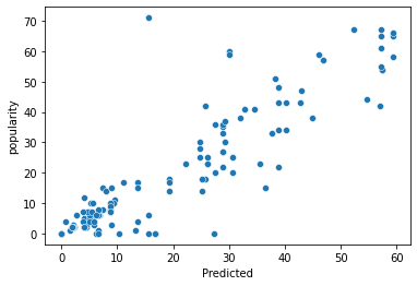
- MSE: 85.89374999999998
- R squared: 0.7876790842617676
So we can see that our mean squared error went down, compared to the linear model and the r2 score went up. Both of these are improvements, so let’s try cross-validation on this model and see how it performs.
Cross-Validation
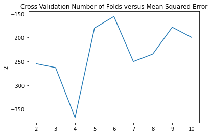
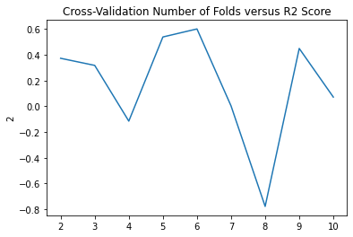
5-6 folds appears to give us the best MSE and R squared scores.
Conclusion
To sum up our findings, we discovered that there are quite some differences between the most popular songs compared to the rest of the songs, as well as between different eras. We also build graphs to look at which songs are more similar to the others, and looked at text analysis techniques for looking at their lyrics. Lastly, we used these findings to build regression models to predict the popularity each song will have. Here is the code for you to look at more closely: https://github.com/DeaBardhoshi/Data-Science-Projects/blob/main/Music%20System.ipynb and https://github.com/DeaBardhoshi/modeling-analysing-songs/blob/main/Music System (1).ipynb
I hope you enjoyed this article and thanks for reading!
