Urban Resilience: Population Dynamics, Scale Laws and Spatial Equity
Hello and welcome!
Set-up and Intro
I have been thinking about different issues in urban planning for quite a while, and one main question that has piqued my interest is: “what makes a city resilient?” Why do some cities manage to withstand and overcome different challenges whereas others struggle with them a lot more? Or why are there hyperlocal differences (e.g. between neighborhoods) in a city’s resilience efforts? This multi-part story is an exploration of urban resilience in the context of Tirana, the capital of Albania.
There have been many candidate answers to this question: the CDC uses the Social Vulnerability Index (SVI) to measure a census tract’s vulnerability to challenges, both human-made and natural. SVI includes factors like poverty, lack of vehicle access and crowded housing to produce a final ranking for a particular tract. This index can be used to address issues like “deciding how many emergency personnel are required to assist people” and to “identify areas in need of emergency shelters”.
In this story, I want to not exclusively focus on the “disaster management” aspect of resilience. Rather, let’s consider resilience as per the OECD definition: Resilient cities are cities that have the ability to absorb, recover and prepare for future shocks (economic, environmental, social & institutional). For Tirana, in particular, it’s important to understand resilience in the context of population change and the rapid urbanization that took place starting from the 1990s. Rapid urbanization can put a lot of pressure in a city’s land and service resources, and resilient cities are those that ensure their residents have equitable access to them. How have these dynamics developed over the past 30 or so years?
For this story I’ll use population count data from the City of Tirana Open Data Portal (data + license: Creative Commons Attribution) and packages like PySAL for spatial analysis and seaborn and pandas for data visualization. Let’s get started!
Power Law
Urban planners have tried to capture the idea of a resilient city by looking at urban form. One major instance of this is scale hierarchy or power laws. A power law is a relationship between x and y that can be modeled using this formula and shape:
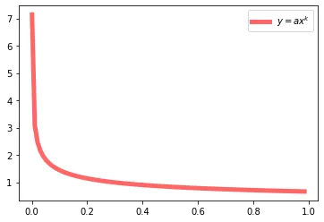
It turns out a lot of relationships can be described using power laws: frequencies of last names (a few names are very popular so they show up with really high frequency), energy consumption (a few geographical areas consume the majority of the energy). In urban planning in particular, scale hierarchy/power laws turn up in the distribution of subway stations, residential densities, and even job counts.
Visualizing the Data
Let’s take a look at Tirana’s population distribution over data for 3 years: 2009, 2015, and 2021:
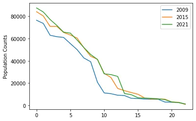
It seems these counts deviate slightly from a power law, at least qualitatively. There also are more tests to conduct to test for a power law, such as the Kolmogorov-Smirnov. However we would need to make a series of assumptions to actually carry those out (like the values being independent of each-other). For now, let’s take a closer look at some of these neighborhoods.
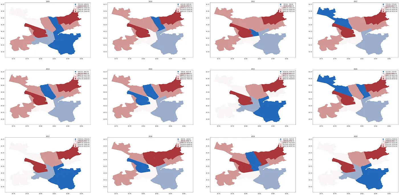
What might be some of the reasons behind some of the deviations? There can be many: sudden growth of certain areas, outward migration, movement within neighborhoods etc. Here is a map of the populations for each of Tirana’s 24 areas across the years 2009–2020:

Note the gradual increases in periurban areas: during the period after the fall of Communism, a lot of people moved into the areas bordering Tirana, often building their homes in the old expropriated land, eventually becoming a key part of the economical life of Tirana (more on this here).
How about the core 11 areas that make up urban Tirana? Here is the filtered out map:
Spatial Markov Movels
To analyze these population counts dynamics more in-depth, we have to build models that express behavior through time. Markov models come in handy for this, allowing us to model transition and stationary probabilities for discrete states. In this set-up, we can specify 4 (customizable) buckets for the population counts of the areas:
- 🪣 Bucket 1: [0, 5690] , Bucket 2: [5691, 12018], Bucket 3: [12019, 50184], Bucket 4: 50185+
At each moment, we can be in any of these 4 states, and the chance we are in state i only depends on the previous state (i — 1), also known as the Markov Property. Thus, we obtain transition probabilities of a neighborhood going, for instance, from having a population count in Bucket 1 to a population count in Bucket 2.
In this particular case study, however, it is very likely that our areas exhibit a degree of spatial dependence. For instance, if one area is very densely populated, it’s likely that the areas around it are also densely populated. To account for this, we focus on Spatial Markov Models. These models require that we compute a weight matrix W that describes this spatial dependence. First, though, let’s use Moran’s I to check if the neighborhoods are indeed spatially dependent:
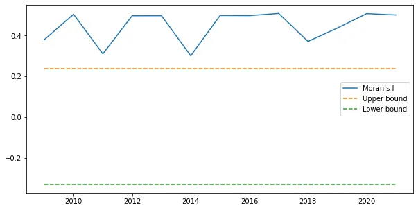
Moran’s I checks global spatial autocorrelation: we expect similar valued areas to be close together, and different valued areas to be far apart. In its essence, it is a metric used to measure the spatial dependence we need to consider. As you can see in the plot above, Tirana’s administrative areas and their population counts exhibit a strong degree of spatial autocorrelation, above both the upper and the lower interval bounds.
Let’s now take a look at how we can compute the spatial weight matrix W that accounts for this dependence. There are several ways: for this project, I am choosing Queen Contiguity, which models neighboring polygons as being those that share at least an edge or a vertex, and outputs the W matrix.
The W matrix is 22 by 22 matrix, with 1s for each value (i, j) where the ith row’s polygon intersects one of jth column’s vertices or edges. Now we are ready to input our yearly population data and the W matrix into a Spatial Markov instance.
Spatial Markov Results
Note that we will obtain 4 separate matrices: one for each bin a polygon’s neighbor can be in. Here is a look at the results:
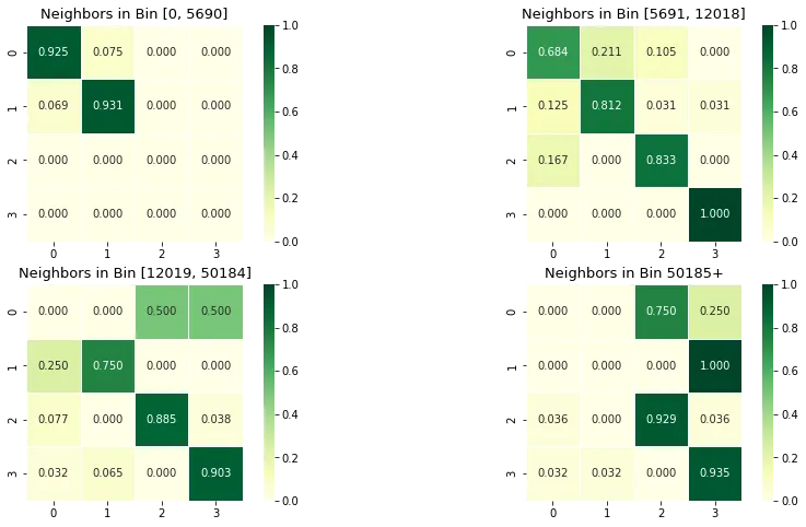
There are some interesting patterns:
- if a “population < 5690” area is surrounded by other “population < 5690” areas, it keeps staying in that bin with a chance of 0.925, but if it’s neighbors are “population between [5691, 12018]”, that chance goes down to 0.684, so the first area’s population is more likely to increase.
- Similarly, a “population [5691, 12018]” area is more likely to remain like that if its neighbors are in the lowest bin (0.931), but less so (0.812) if its neighbors are the same bin.
You can draw similar conclusions using the rest of the values. Importantly, each area is most likely to stay in the same bin rather than switch. This also makes logical sense: in the relative short-term a place likely retains its present character, rather than undergoing drastic changes.
Implications
Why are these results useful? As we saw, looking at sustainable growth and decline is an important part of a city’s resilience. These tools, including measuring power law fits or Spatial Markov Models allow us to understand these dynamics more precisely. I wanted to delve a bit deeper into these predictions and look at what they mean for specific neighborhoods in Tirana. Let’s get started!
Let’s take a look at what these results entail in the context of specific neighborhoods. As of 2021, the most populated areas of the city are Area 5, 2, 7, 4 and 11 followed closely by Kashar, a municipality outside of the bounds of Tirana proper with many new developments. Here is a quick visualization:
Kashar is an interesting example of periurban growth with companies like Coca-Cola, Vodafone, Top Channel and smaller businesses setting up shop there. In 2009, its population was just 20829 but as of 2021, it has almost tripled to 58664 people. These areas of very rapid growth are also some with the highest need for sustainable solutions: Kashar grows with about 11 new people a day and has a relatively young median age of 33 (source).
The other highest population areas have seen their own growth in the past 12 years:
Its interesting that these areas are neighboring each other: this enforces the intuition that the trends happening in places around a neighborhood likely influence the character of that neighborhood as well.
Some Examples
Let’s focus a bit on admin area #5. Its immediate neighbors are areas 7, 10 and 2 which have populations of 77124, 27637 and 83827 respectively. According to the spatial Markov results, given these neighbors, area #5 has a chance of about 90% of staying in the highest population bin. It also has a chance of about 5% of falling in the first and second bins.
Area #10 is another neighborhood in Tirana encompassing the city square, business district (Blloku/The Block) as well as some of the most bustling streets of Tirana. Its 2021 population is 27637 and its neighbors have populations of 77000–87000. Based on the Markov results, it would have around a 93% chance of staying in its current population bin.
Step #2: School Data & Spatial Equity
When it comes to resilient development, cities should work towards providing high-quality resources to people living across all neighborhoods. The concept of a geographical availability of resources is also known as spatial equity: in a city working to provide all citizens access to similar opportunities, this means that people would have equal access to public spaces, a clean environment and institutions such as schools.
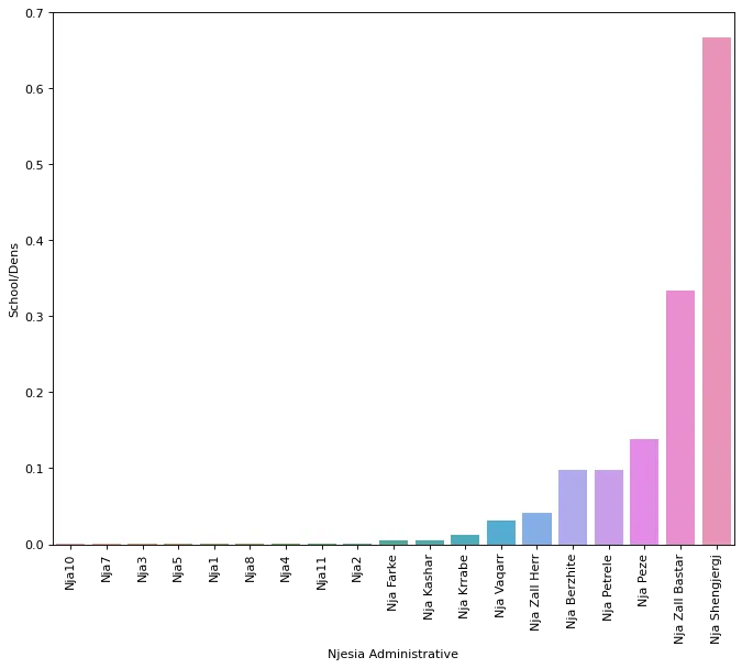
In this context, I want to explore the distribution of schools as a marker of spatial equity. Are all children throughout Tirana served with accessible, high-quality schools? Are there areas that are disadvantaged? What are some school trends and patterns? For this, I’ll be using data for Tirana’s middle and primary schools (together known as “9-vjecare”) (link, licensed with a Creative Commons Attribution license). Here is a visualization of school density in each of Tirana’s administrative areas:
And here is the same visualization, only focusing on the 11 urban areas:
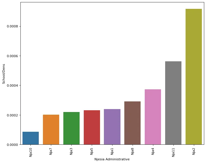
At a glance, it seems that the areas with the highest density are in fact those outside of the 11 main admin areas. Namely, places like Shengjergj, Zall Bastar and Peze turn out to be the top 3. What does this mean for the kids who attend these schools? Is it necessarily easier for them to go to school safely or reliably?
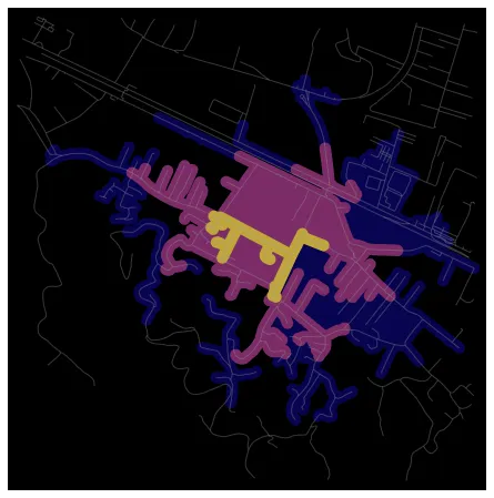
Here is a street network visualization for walking from one of Kashar’s schools, “Sadik Stavileci”. The graph shows isochrones for how far you can travel from the school if walking in 5, 10 or 15 minutes (assuming a speed of 4.5 kilometers/hour).
 ]
]
As you can see, the distance kids can cover in a few minutes is probably not that great. This tool, however, is useful when planning out building projects so that a place is easily accessible by the people meant to use it. What is a reasonable time to walk to and from school? How do we improve services like transit or biking so that children are able to go to their schools safely? As a starting point on these, it would be interesting to calculate isochrones for all of Tirana’s schools and compare them to how many children would be within walking distance.
Sidebar: I made these graphs using OSMnx, a network analysis package that combines OpenStreetMaps data as well as network metrics. Here is the source notebook for doing this operation (isochrones).
Measuring Inequality: Spatial Autocorrelation
To measure inequalities in the spatial distribution, there’s a few other metrics we can use. Spatial Autocorrelation is one, and it consists of computing Moran’s I (which we did in for population counts in part 1). This is done to test the null hypothesis that schools in Tirana are distributed uniformly. The result from the test is 0.186 (p-value of 0.111).
PySAL also gives us two ways of visualizing autocorrelation: Moran’s plot and the distribution of Moran’s I under the null hypothesis:
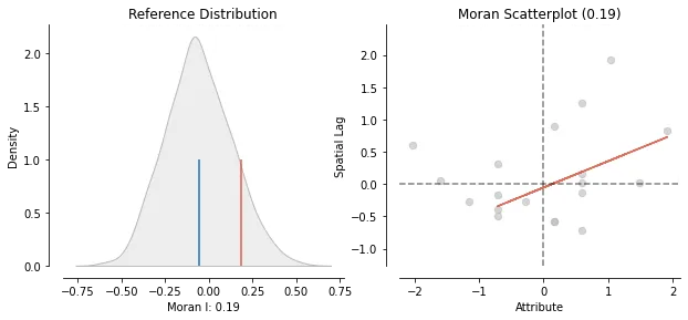
Moran’s plot shows the # of schools plotted agains a lagged # of schools (obtained by multiplying the number of schools and a spatial weights matrix). Qualitatively, we interpret the plot as showing positive spatial autocorrelation when the data points exhibit a high correlation. The distribution, on the other hand, is an empirical one: it is obtained by simulating a series of maps with randomly distributed schools counts and then calculating Moran’s I for each of them. (blue line: mean of distribution, red line: observed statistic in Tirana’s data)
📔 Conclusions + Notebook
This concludes this project! Overall, I believe using spatial data science tools is something relatively unexplored, especially in the Albanian context, but definitely very useful. This project could be enriched with more fine-grained data (as in the schools example). Until then, here is the updated notebook.
Thanks for reading!
